Fintech•2024
MoneyPinch
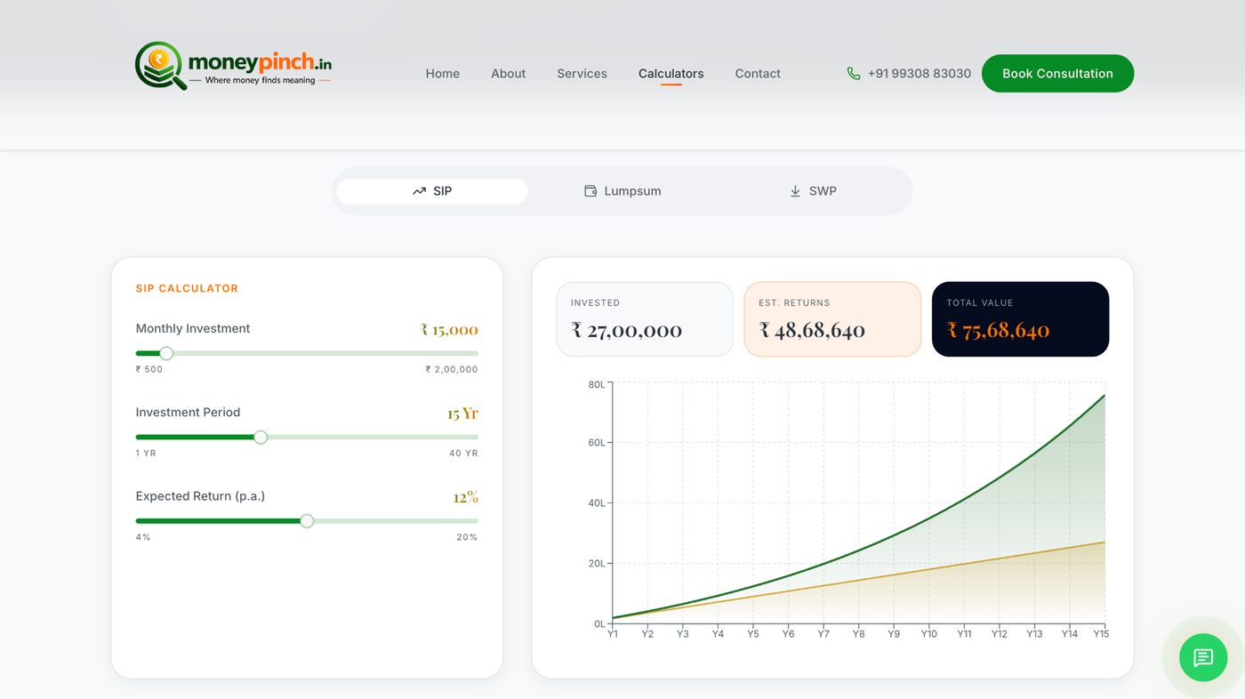
A dashboard people actually enjoy — and a marketing site that converts trials 43% better.
+43%
Trial-to-paid conversion
-58%
Time-to-first-value
measured from signup to first saved report
-71%
Support tickets on setup
+11pts
Net revenue retention
twelve months post-launch
The challenge
MoneyPinch had strong technology but a marketing site that looked like a template and a dashboard that felt heavier than the numbers it showed. Trial-to-paid conversion was stuck below industry benchmarks.
Our approach
- 01
Ran two rounds of user research with existing customers to isolate the moment of activation.
- 02
Redesigned the marketing site around that activation moment — the demo is above the fold on mobile, not below.
- 03
Rebuilt the dashboard with a focused KPI hierarchy, real-time streaming data, and playful micro-interactions on save events.
- 04
Wired product analytics + revenue attribution so every acquisition source is measured to LTV.
“The design work paid for itself inside a quarter. The dashboard is now the thing users show us at conferences.”